Monday, December 8, 2008
STAR PLOT
The star plot is a way of displaying multivariate data. Each observation is represented as a "start" and the length of the rays are made in proportion to the size of that variable.
CORRELATION MATRIX
This is a correlation matrix taken from: http://www.kltprc.net/policynotes/Gifs/Tab_005A_4.gif
This is a type of map that shows correlation over several variables. The diagonal elements within are always equal to 1.0
SIMILARITY MATRIX
This similarity matrix shows the temporal similarity of a group of 512 photos and is taken from: http://www.fxpal.com/systems/MediaAnalysis/sim10000.gif
This type of map is a matrix of numbers that represents similarity between data points.
STEM AND LEAF PLOT
BOX PLOT
Box plots are convenient ways of graphing data through five number summaries. These numbers include the smallest observation, quartile 1, median, quartile 3, and highest observation.
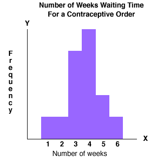
HISTOGRAM
A histogram is a graphical display of tabulated frequencies, shown using bars. It differs from a bar chart in that it is the area that shows measurement rather than the height of the bar.
PARALLEL COORDINATE GRAPH
A paralllel coordinate graph shows continuous lines in "n-dimensional space." Each parallel coordinate graph shows infinite amounts of data.
TRIANGULAR PLOT
A triangular plot is a plot of three variables that always sum to one constant. Because this constant sum is present, only two numbers must be known to complete the plot.
WINDROSE
CLIMOGRAPH
A climograph shows monthly precipitation and temperature for a given area.
POPULATION PROFILE
A population profile is a chart showing the number of people as a function of their ages.
SCATTER PLOT
INDEX VALUE PLOT
Values for an index value plot are plotted on a line graph.
LORENZ CURVE
"The Lorenz curve is a graphical representation of the cumulative distribution function of a probability distribution" (http://en.wikipedia.org/wiki/Lorenz_curve)
BILATERAL GRAPH
"A bilateral graph shows increases on one side of a zero line and decreases on the other. It is used when there are both positive and negative values involved in the data." http://www.pastpeak.com/archives/economy/index.htm
NOMINAL AREA CHOROPLETH
This type of map shows nominal data that is not ordered in any way however the areas are still clearly defined.
UNSTANDARIZED CHOROPLETH MAP
Unstandardized choropleths are not averaged and show raw data in the map.
STANDARDIZED CHOROPLETH MAP
Standardized choropleth maps show a standardized comparison of distribution among different areas.
UNIVARIATE CHOROPLETH MAP
This is a univariate choropleth map of water in the United States taken from: http://content.answers.com/main/content/wp/en/thumb/2/28/180px-Choropleth.gif
Univariate choropleth maps display a single set of data.
Sunday, December 7, 2008
BIVARIATE CHOROPLETH MAP
This is a type of choropleth map that compares two variables.
UNCLASSED CHOROPLETH MAP
This is the least accepted way of mapping because it is said the cartographer "loses the ability to direct the message of communication." Shadings that are proportional to the values in the data are assigned for this type of map.
CLASSED CHOROPLETH MAP
These type of maps show an easy way to visualize data over a geographic area. Here the shading intensity determines the quantity of the variable being measured.
RANGE GRADED PROPORTIONAL CIRCLE MAP
CONTINUOUSLY VARIABLE PROPORTIONAL CIRCLE MAP
These type of maps uses circles in diferent sizes to correlate to the quantity of the specific variable that is measured in the map.
DOQQ
A Digital orthophoto quarter qudrangle (DOQQ) is
a representation of a quarter of the area of a conventional USGS 7.5-minute topographic map produced using aerial photographs at a scale of 1:12,000 (http://www.safnet.org/workinggroups/a2/A2_summer2008.pdf)
DEM
DEMS are digital representations of ground surface topography or terrain. Used very frequently in GIS, these maps can be made of a grid of squares or triangular irregular networks.
DLG
DLG's are "digital vector representations of cartographic information. Data files of topographic and planimetric map features are derived from either aerial photographs or from cartographic source materials using manual and automated digitizing methods." http://edc.usgs.gov/guides/dlg.html
Saturday, December 6, 2008
DRG
DRG is a scanned image of US Geological Survey topographic map. Geo-referencing information is added to these maps to associate them with their true position on the ground.
ISOPLETH
Isopleth lines connect points of equal measurment.
ISOPACHS
This is a map of isopachs of the ashfall from the eruption of Cerro Negro taken from: http://www.geo.mtu.edu/volcanoes/central_america/nicaragua/cerro_negro/gvn/images/2012neg4.jpg
Isopachs are countour lines that connect points of equal thickness.
ISOHYETS
This is a picture of isohyets in India taken from: http://www.unu.edu/unupress/unupbooks/80391e/80391E00.GIF
Isohyets on maps are curves that connect points where the function has the same particular value.
ISOTACHS
This is a picture showing wind directions using isotachs from: http://www.crh.noaa.gov/lmk/soo/research/papfigs/11794pap_fig3.gif
Isotachs are lines of equal wind speed drawn on maps.
ISOBARS
Isobars are contour lines of equal pressures used in meteorology.
LIDAR
Light Detection and Ranging (LIDAR) technology measures the properties of scattered light to find information about a distant target.
DOPPLER RADAR
BLACK AND WHITE AERIAL PHOTO
Black and white aerial photos are similar to infrared photos in that they can show change in the earths surface. However, they typically are able to show more detail.
INFRARED AERIAL PHOTO
CARTOGRAPHIC ANIMATION
A cartographic animation is the animation of data classification and a series of related variables from a single time period.
STATISTICAL MAP
Statistical maps show the distribution of a variable over a given area.
Wednesday, December 3, 2008
CARTOGRAM
FLOW MAP
This is a flow map courtesty of: http://images.google.com/imgres?imgurl=http://mundi.net/maps/maps_014/august2000_small.gif&imgrefurl=http://mundi.net/maps/maps_014/&usg=__M47WvQ_xrwevOAxw1coAVBpT-sE=&h=363&w=400&sz=16&hl=en&start=3&um=1&tbnid=Z1kQB12E-xPQyM:&tbnh=113&tbnw=124&prev=/images%3Fq%3Dflow%2Bmaps%26um%3D1%26hl%3Den
It depicts traffic flow (in terms of voice minutes) between countries. The thicker the line, the more traffic there is.
Tuesday, December 2, 2008
ISOLINE MAP
PROPORTIONAL CIRCLE MAP
CHOROPLETH MAP
Choropleth maps are thematic maps and only show 1 set of data. For this reason a one color scheme was chosen and in a light to dark manner.
DOT DISTRIBUTION MAP
This is a way of showing distributions over a given area using dots. However, as you can see by this map it can be misleading as this map would lead the reader to believe that only certain areas are populated!
PROPAGANDA MAP
Propaganda maps are designed to have the maximum impact on the reader/viewer in an effort to persuade of them of a particular belief.
HYPSOMETRIC MAP
Hypsometric maps use shading or tinting to show elevation and coutour of a particular area.
PLSS MAP
The Public Land Survey System (PLSS) is a way of deviding land in the Unites States.
CADASTRAL MAP
Cadastral maps show boundaries and ownerships of certain pieces of land.
Thematic Map
A thematic map "displays spatial pattern of a theme or series of attributes." (http://en.wikipedia.org/wiki/Thematic_map